Branding, Editorial Identity, and Cultural Narrative for a Russian Language School in Mexico.

LANGUAGE, CULTURE, AND DEEP NARRATIVE
We redesigned the visual, editorial, and verbal identity of Escuela RUS, an educational project that seeks to bring the Russian language closer through a warm, contemporary, and accessible perspective. Our approach combined design, pedagogy, and culture to build a coherent, breathable, and deeply human visual system.
EDITORIAL PROJECT
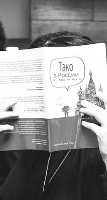
“Sr. Taco”: Learning Russian from the Essentials We developed an A1-level book conceived as a visual and narrative experience, not just material—a synthesis of form and purpose in function.
We created a character—Mr. Taco, observant and curious—who accompanies the student on a journey through Russia.


Warm and approachable tone, with subtle humor. Pedagogical content structured with clarity.
The book teaches Russian intuitively: each page breathes, each element has a purpose.
“Ruso es…”: Culture Without Solemnity
The second publication of the project explores Russian culture with honesty: myths, stereotypes, irony, beauty, contradictions.

We designed a book that informs without taking itself too seriously, yet always with precision:
Clear and elegant typography.
High-contrast editorial composition: the absurd alongside the aesthetic.
Visual references to 19th- and 20th-century Russian design, reinterpreted in a contemporary way.
The result is an editorial object that honors the Russian character: direct, sharp, and subtly ironic.
Branding and Communication
RESTYLING OF THE IDENTITY
We built a complete visual system for the school: logo, palette, typography, editorial materials, social media templates, and digital communication.
The identity combines warmth with academic rigor, featuring an aesthetic inspired by Russian graphic traditions, reinterpreted for a contemporary context:
Warm and inviting palette.
Restrained typography with classical resonances. Clean editorial grid.
Narrative iconography centered on characters, culture, and learning.
Each piece communicates professionalism without rigidity, and culture without solemnity.

VISUAL AND VERBAL PHILOSOPHY OF THE PROJECT
Design that teaches. Every visual element is born with pedagogical intent.
Measured editorial language.
We build trust without heavy-handed discourse. Culture presented with openness.
Russia through warmth and honesty, not clichés.
Inclusive narrative.
Mr. Taco, students, and teachers coexist within a coherent, approachable, and friendly visual universe.
BRAND PHILOSOPHY
This project is based on the idea that: Learning a language should not be noise, but a slow, meditative, and orderly act.
Cultural narrative is built from intimacy and respect.
The beauty of a pedagogical system also lies in its visual clarity.
We created for Escuela RUS an identity that balances the linguistic, the cultural, and the aesthetic; a brand that teaches through design and connects through sensitivity.
SIMILAR PROJECTS